project life – 2013 album
I’ve started getting my supplies together for my 2014 Project Life album at the same time as I’m finishing off my 2013 album.
Last year my approach was digital/hybrid. This year I’m going back to a more paper-based album, but I’ll be sticking with the monthly approach that I’ve used over recent years, as well as (maybe) keeping photos on the same theme together. It’s a vague plan for now, so I’ll see how it goes.
I’ve never really tried a chronological weekly approach. I don’t think it would work for me.
Now that I’m putting the finishing touches to my 2013 album (I finished the cover layout last night) I wanted to post some photos of what it looks like.
First up, the cover. I’ve been working on this over the whole year and changed it as I went along. The idea was to fill the pages with quotes and things that spoke to me during the year.
It has a front
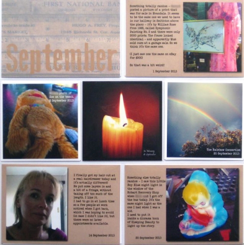
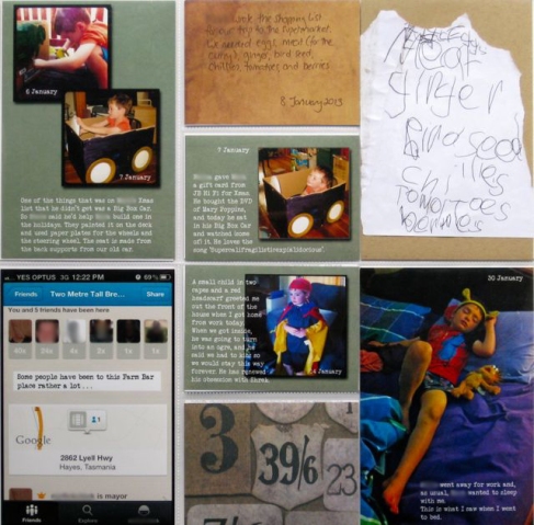
 Each month has its own title page, followed by a few pages of random photos and journalling from the month, as well as layouts that cover a specific event or theme (somewhere we’ve visited, Juniordwarf’s school stuff, a major event, whatever needs more than one or two photos).
I’ve mainly been using Design A for the month title pages.
 But I also like this design from We R Memory Keepers.
 The main design I’ve been using has been Design A. This layout is from our trip to Dunalley in March.
 Sometimes I’ll use different designs, depending on how many photos I have, and what the orientation of most of them is. Design D.
 I love Design C, which is six 6×4 landscape photos.
This is part of a double spread that also uses another page by We R Memory Keepers that has three 6×4 landscape photo slots and a 6×12 slot. Perfect for adding in over-sized visitor guides. And I can fit in even more photos in by using a photo collage app like PicFrame.
 And on the other side, the opportunity to make s 6×12 scrapbook layout to go with three 6×4 photos.
 One of the other new designs I’ve been using quite a bit of is this half page design by American Crafts. It’s perfect for times when I don’t need a full page, but want to keep the photos separate instead of combining them with unrelated photos on a 12×12 layout.
 I’ve been incorporating my 12 of 12 photos and journalling into my album as well. I’ve been using PicFrame to create the collages. Design A, Design C and the We R Memory Keepers square design all work well. The one I choose will depend on what’s going on the other side of the layout.

 The other thing I’ve been doing – well I only recently discovered it – is to use the Collect app to create 3×4 cards that can slot into the 3×4 vertical slots with no extra work required.
 For November I ran these cards throughout almost every page.
 I think these would work well on a page with lots of 3×4 pockets, like Design F (which I used in 2012 and you can see in this post) or Design U, which is entirely 3×4 pockets.
So that was 2013. All I have left is the remaining photos from December and some from September, and a few scrapbook layouts, which I will just include in the relevant month. Then I can really get stuck into 2014.


